Assist
A micro-volunteering platform
Assist is a micro-volunteering platform designed to let people get help when they need it most. Assist was created via inclusive design practices, making it a compelling example of how focusing on a specific disability can yield powerful solutions.
Our research began with emphasis on a specific group of people and a specific scenario.
How might we help someone with low or no vision navigate an unfamiliar building accurately and confidently?
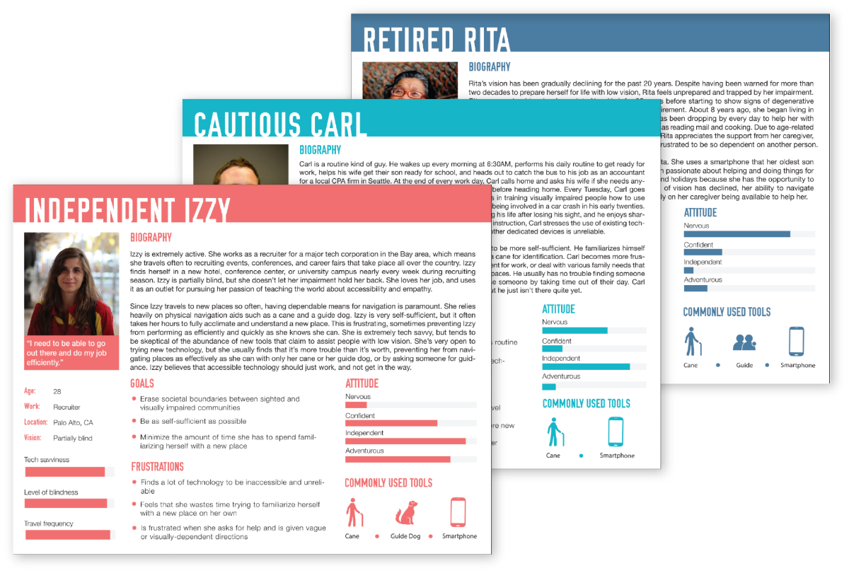
Based on all of our research, I created three personas to guide our design process.
Our team brainstormed solutions using our research findings and our personas. We came up with more than 50 solutions ranging from an accessibility review platform to a rolling cane that pulls users automatically toward their destination.
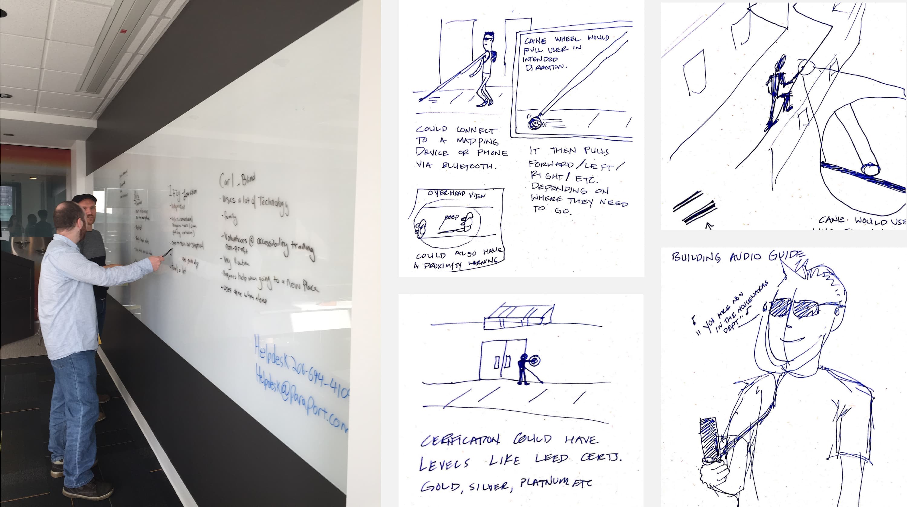
After all of our sketching, we were still unsure which direction we should go in. We returned to our research findings for further analysis. Using affinity diagramming, we looked at our research through different lenses. We noticed that the people we talked to didn't really express strong pain points around navigation at all. The problem seemed to be more that they felt like a burden for asking others for help. This helped us completely reframe our thinking.
The problem that we were trying to solve was less about helping people navigate spaces than it was about getting people help when they need it most.
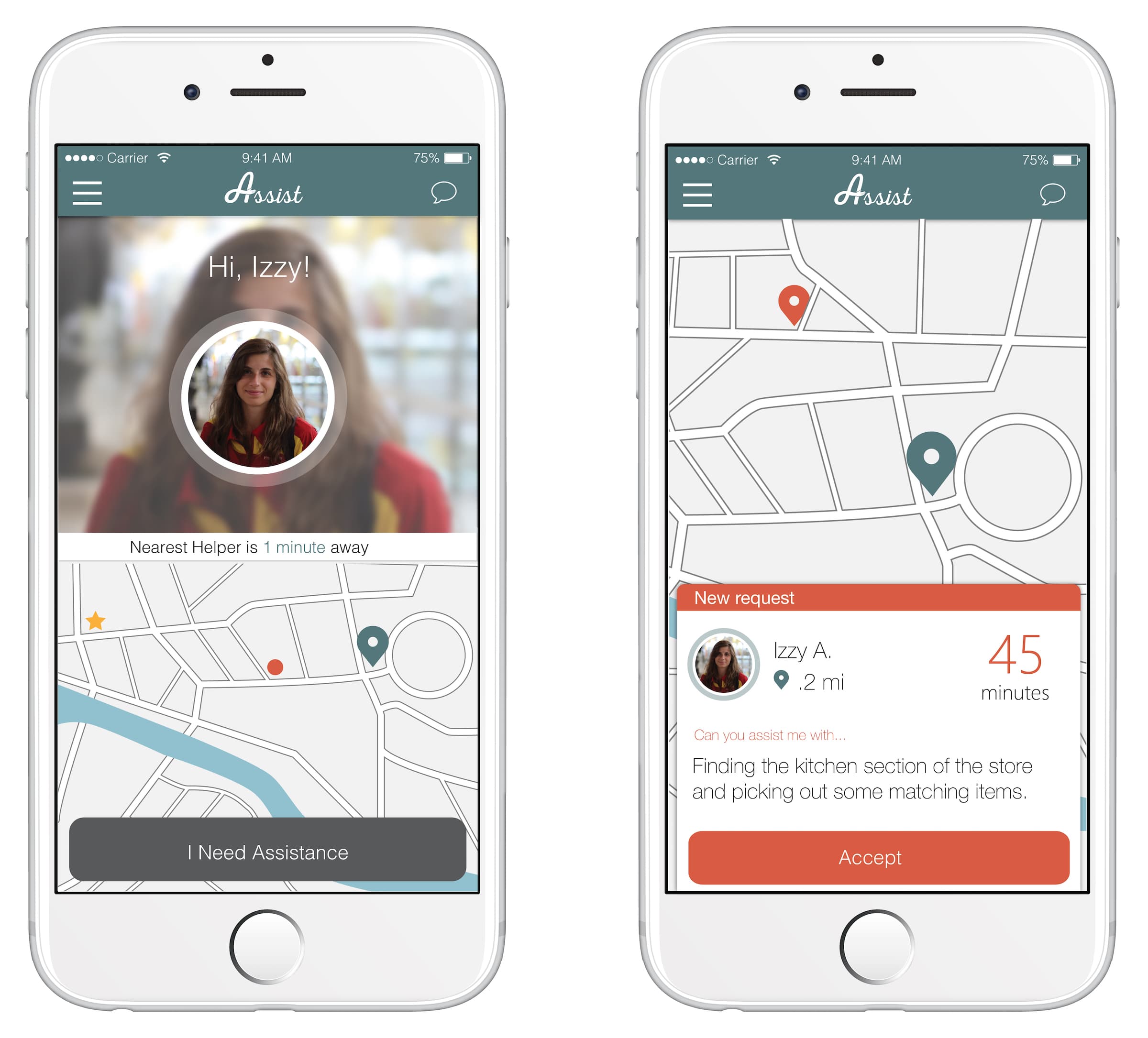
With this insight, we shifted focus to an application that would help people get the help they needed when they need it through a micro-volunteering platform: Assist.
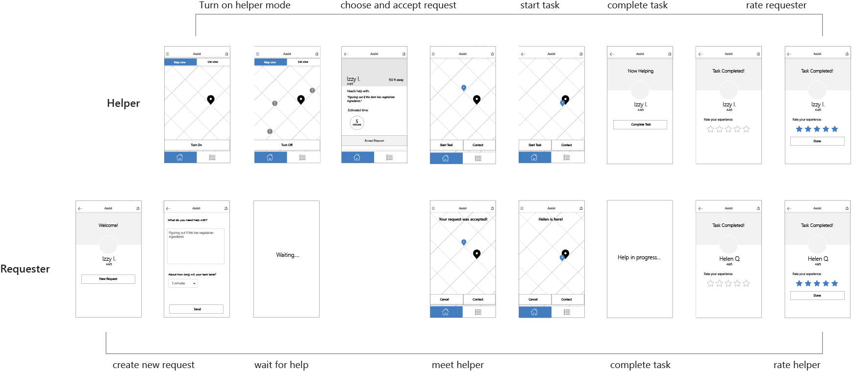
I did an exercise to map the interaction flow of the system. Because Assist is a multi-sided platform, it was important to lay out the interaction of both the helper and the requestor side by side to see how both experiences work together across the system.
We created two sets of low-fidelity prototypes. The first set focused on the help request experience. The second set focused on the volunteering experience. We created paper prototypes for both experiences. For the volunteer experience, I used InVision to create an interactive prototype.
Because we wanted to be able to effectively test with our target user group, people with disabilities, we kept a physical paper prototype of the help request experience.
We tested both prototypes to get feedback on the concept and to understand usability of our first design.
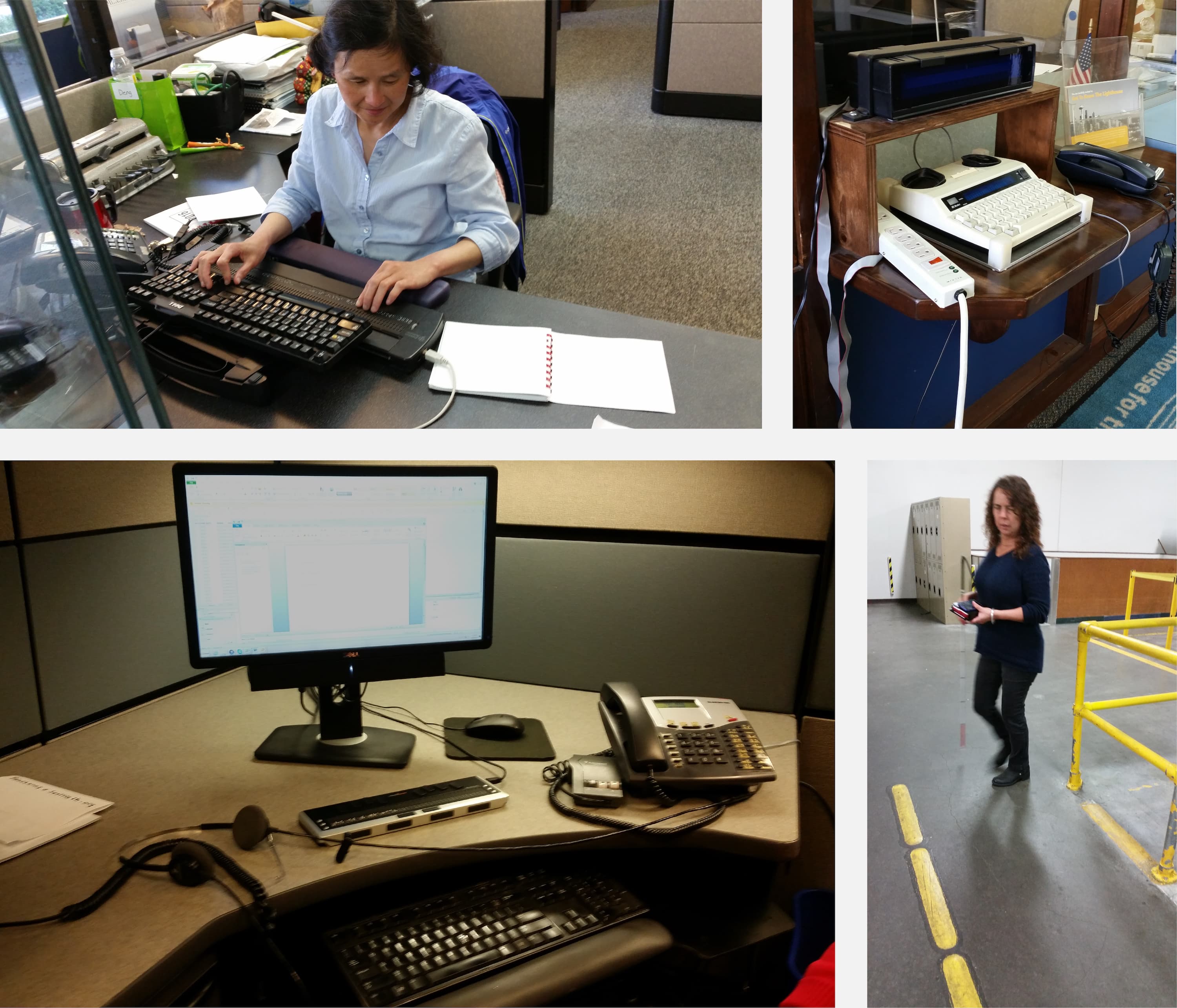
When testing with people with vision impairments, we had one team member mimic a screen reader while
another
swapped out screens and UI elements.
Participants liked the concept of the app and thought it would be helpful and enjoyable to use.
On several screens, the order of elements read was confusing for people with vision impairments. People particularly struggled with the task time estimation screen.
Volunteer participants were confused by the checkmark button> at the bottom of the screen.
Participants with vision impairments stressed the importance of trust and safety, suggesting that we provide better ways to build relationships between volunteers and requesters.
Using our findings from usability testing, I created a second iteration of our design that put an emphasis on trust and safety as well as clearing up some of the components that our participants found to be confusing.