Logo reading EQ Assistant; taking the guesswork out of communication
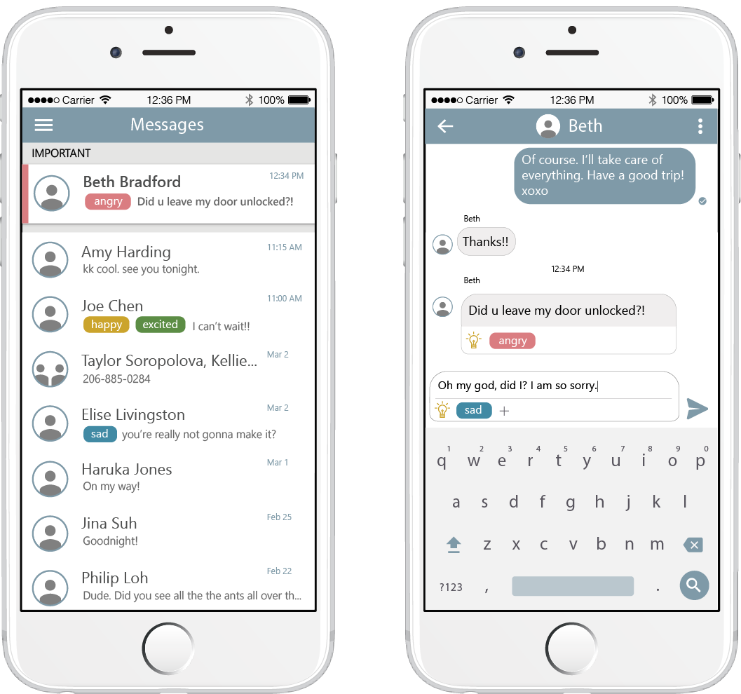
Two phone mockups. The first shows a message list with emotion tags. Another showing a chat with emotion tags being added.

My Role

  • Interaction Designer
  • Visual Designer
  • Researcher

Summary

EQ Assistant is a chat assistant that uses Machine Learning and Artificial Intelligence to surface emotions in text messages to help people communicate more effectively through reducing misunderstanding.

Project Team

  • Jina Suh: Researcher, Prototyper
  • Philip Loh: Researcher, Data Analysis
  • Haruka Jones: Researcher, Content Writing

Duration

  • 10 weeks

The Problem

Have you ever mistaken a short text response from a friend as anger or indifference? We lose so much information about emotion through text messaging. For many people, however, text-based messaging is a preferred and primary way of communicating with others. Modern text communication needs to evolve to fill in these gaps that can lead to misunderstanding and potentially result in stress and problems with relationships.
Users

  • People who use text messaging to communicate
  • People who have difficulty understanding emotions of others

Needs

  • A way to understand emotions more accurately
  • A way to communicate emotions in text more transparently
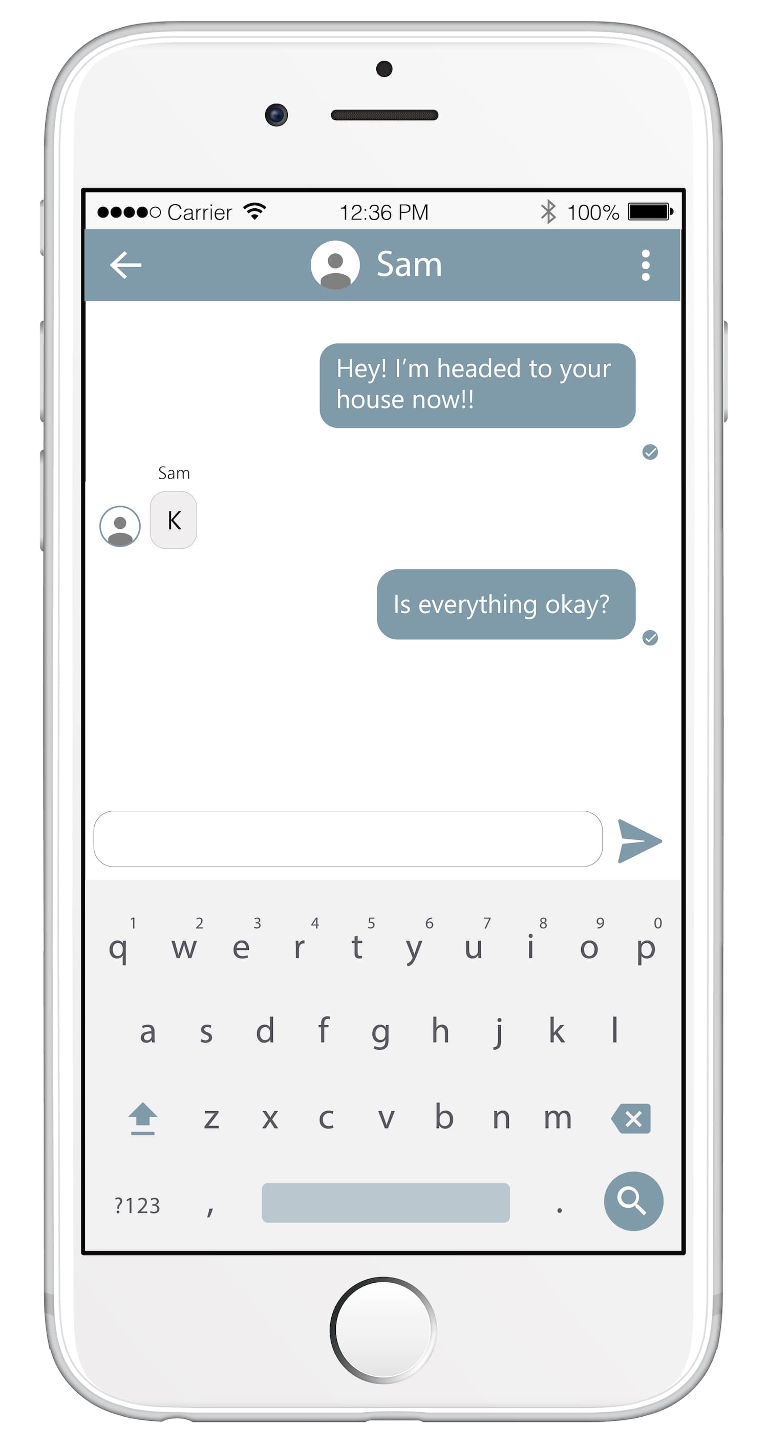
Mockup of a chat conversation between two people reading, Person 1: 'Hey I'm headed to your house now' Person 2:'K' Person 3:'Is everything okay?'

Research

Research Questions

  1. What are the limitations of text-based communication, and who is most affected by those limitations?
  2. How are emotions represented and categorized?
  3. What design principles exist for Machine Learning and Artificial Intelligence User Experience?

Methods

Interviews

My team and I interviewed industry experts in Machine Learning and Artificial Intelligence, and the CEO from an autism activist group.

Literature Review

We reviewed published literature and research on emotions, text-based communication, cognition, and HCI.

Survey

We conducted a survey of 50 people though Mechanical Turk to understand how they interpret emotions.

Key Findings

Our combined research led to 8 principles that influenced the first iteration of EQ Assistant:

Categorize Emotions

Categorical mapping of emotions (e.g. Angry, Happy, Sad) is easiest to interpret.

Identify Anger

Misinterpreting anger has the greatest consequences, so it's the most important to identify.

Design for Inclusion

Cultural differences and disability can result in more difficulty interpreting emotions.

Be Transparent

Displaying Machine Learning model confidence may increase user trust.

Don't Interrupt User Flow

Intelligent agents only work when they don't get in the way.

Augment Existing Experience

Intelligence is most valuable when is augments an existing workflow.

Design for Being Wrong

Machine Learning models are not always correct, which needs to be accounted for in design.

Gather Feedback

Feedback is critical in intelligent systems so that they can improve over time.

Ideation

Using our research findings, I created sketches of possible solutions for EQ Assistant. I explored different types of systems (e.g. platform, app, plugin), as well as a variety of visual treatments, voice, and feedback UX.
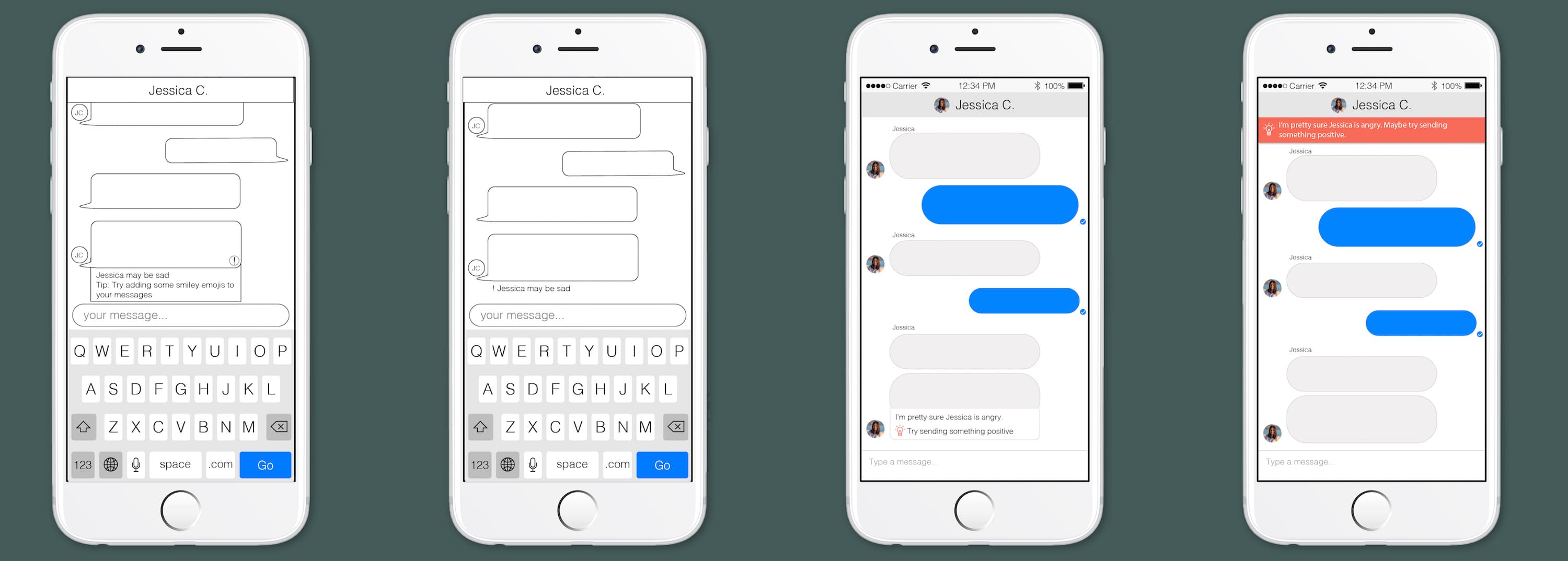
Five low fidelity mockups of the EQ Assistant chat app.

Prototype

Together, we chose a design direction and created a prototype for testing that leveraged our learnings from research.
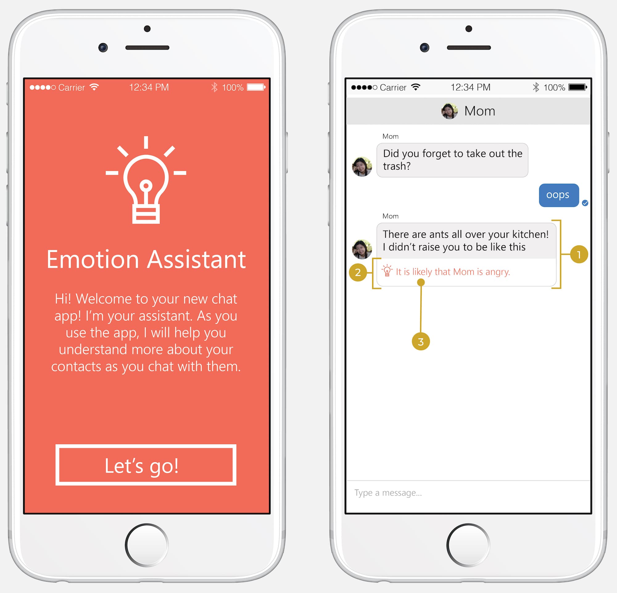
  1. Don't interrupt user flow

    The prediction appears below the message which scores highly for an emotion (in this case, anger), but it does not impede the user's ability to read or reply to the message as usual.
  2. Augment existing experience

    The prediction improves user experience by providing more context about the message. The design treatments (EQ Assistant icon, text, and background color) distinguish the EQ Assistant prediction from the chat message to prevent confusion.
  3. Be transparent

    Because Machine Learning detection of emotions won't be perfect all of the time, we alter the text in the EQ Assistant tip to convey uncertainty. If the model is uncertain about an emotion, the tip will preface it's prediction with "There's a chance..." If the model is confident, the tip will be prefaced with "It is likely that..."
Two EQ Assistant mockups. The first is a first run experience screen that says 'Emotion Assistant--Hi! Welcome to your new chat app! I'm your assistant. As you use the app, I will help you understand more about your contacts as you chat with them.' The other screen shows a chat conversation with numbered UI elements that correspond to the list of design principles before the image'

Evaluation

We wanted to understand usability and likability of our design, so we conducted a usability study using paper prototypes. I developed a set of interview questions aimed at understanding perceptions toward EQ Assistant as a communication tool. We ran our study in-person with 7 participants.


Once the study was complete, our team worked together to analyze the results using qualitative coding and affinity diagramming.
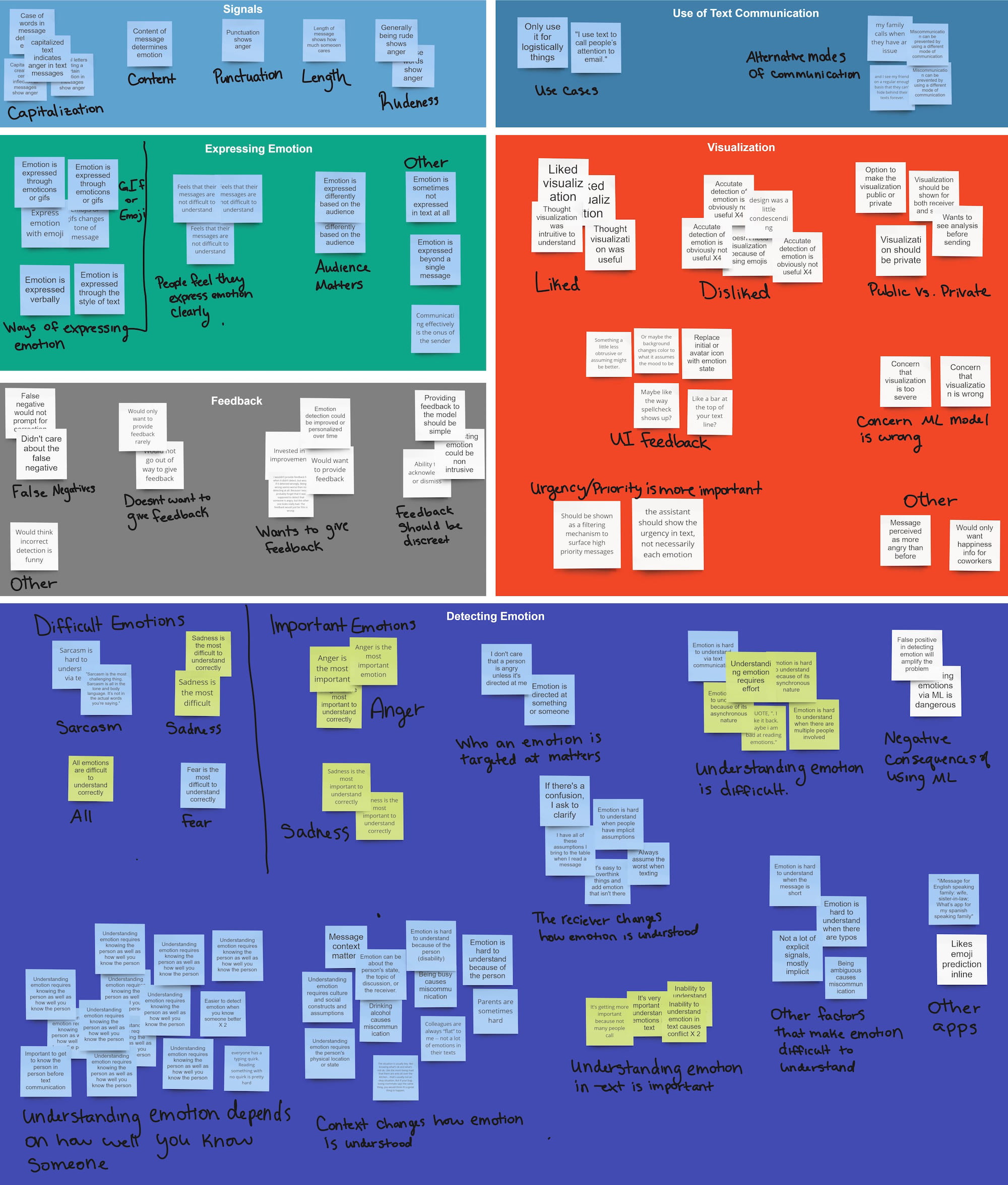
A screenshot of an affinity diagram with many post it notes arranged by topic.

Key Findings

Predictions should be actionable

Participants expressed interest in the idea that emotions could help alert them to more urgent messages.

Emotion analysis needs to be visible to everyone

Participants did not like the idea that their message could be incorrectly interpreted without their knowledge. They wanted the opportunity to verify or change the analysis.

Consider unique relationships

Every participant we talked with mentioned the importance of unique relationships. Communication happens differently depending on the relationship between the people talking. Our design needs to provide more flexibility to allow for unique relationships.

Feedback needs to be part of the core UX

Our participants told us that they were not interested in going out of their way to provide feedback to improve the model. Feedback needs to be built into the way that people interact with the app.

Iteration

Our research helped us see the gaps that existed in our first design. We took our findings and did another round of ideating, affinity diagramming. I then did a round of sketching and prototyping to create a new iteration of EQ Assistant.
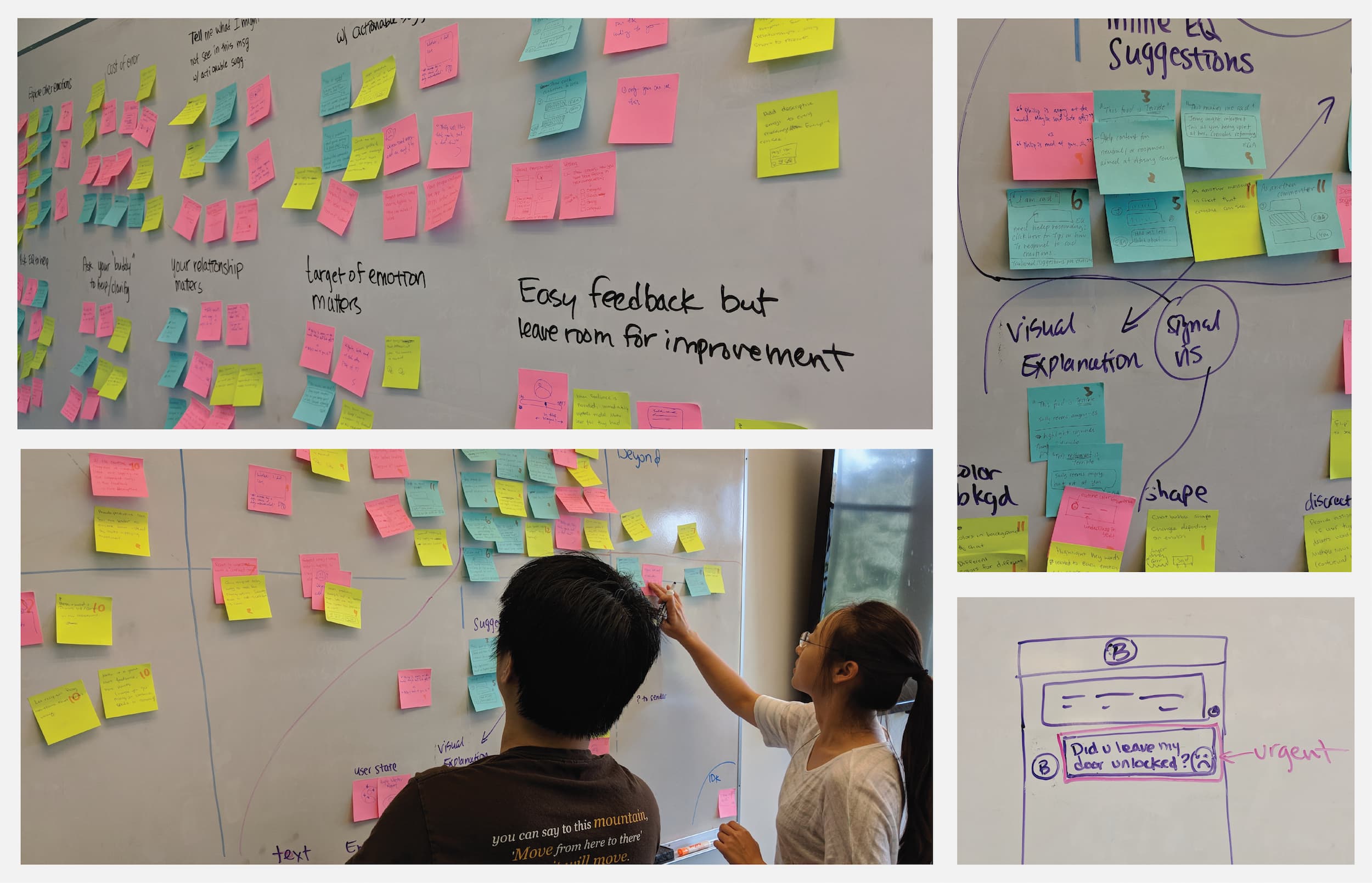
A grid of photographs showing a whiteboard filled with colored postit notes, sketches, and two people looking at the whiteboard.

Final Design

In our final design, we give control to the sender, allowing him or her to add machine suggested tags to messages to aid in clearer communication. Tapping on a suggested tag to confirm it acts as an integrated feedback mechanism.


We also triage messages based on emotional urgency, helping to make the tags more actionable. Users can adjust how emotion tags work for each person they communicate with, allowing for unique treatment per unique relationship.
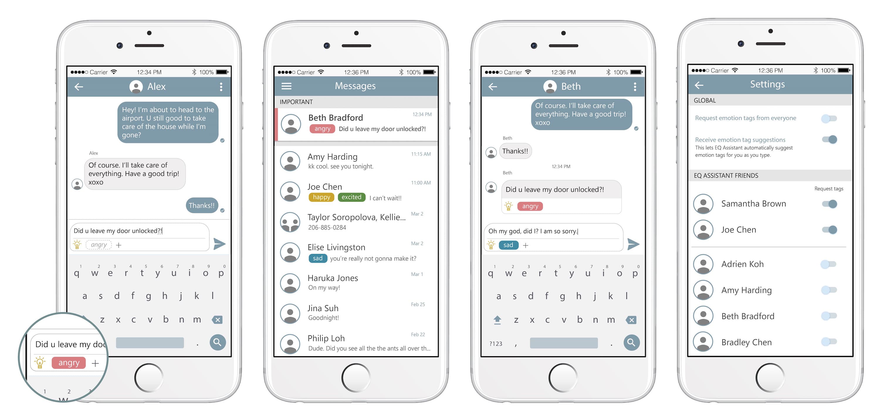
The final design showing 4 phone mockups. First: A chat with a grey suggested tag. Tapping on the tag confirms it and the color changes to pink. Second: A list of messages showing a message tagged as angry at the top, prioritized higher than other messages. Third: A chat screen showing the emotion tags in line with the message thread. Tags appear below each message. Fourth: A settings page that allows emotion tags to be enabled and disabled for individual people.